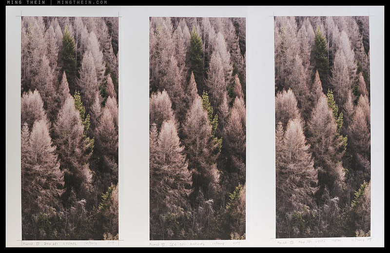
The comparison. This is your field of view at about a foot and a half viewing distance of the crops, which are 10″ high each. Larger version here.
Today’s post is an attempt to do try to convey just how much of a difference there is between an Ultraprint and what would be considered a normal, very good print. Since this is really impossible without seeing the prints in person, a direct comparison is perhaps the closest I can get when working via the internet. What you see here will come as no surprise to people who’ve bought the most recent one or two Ultraprints from Forest III onwards; however, things have moved on a bit since then.
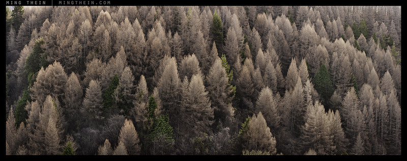
What I’ve done is printed the same file at several output resolutions, with various combinations of settings and hardware (Ultraprints are modified-hardware dependent, too). I’ve used the same paper to keep things consistent – a matte Canson Baryta Photographique, which we’re experimenting with for pushing resolution and ink density even further for non-reflective prints. Here, I’ve taken a 10×4.5″ section of Forest III (full image above) and printed it on a conventional printer at 240PPI*; then again at 360PPI with Ultraprint hardware and settings; and finally, at 720PPI, again with Ultraprint hardware and settings. The original full image is 40×15″.
*Pixels, not dots per inch – you need many ink dots to make up one pixel equivalent – basically, multiply it by your printer’s number of ink colors.
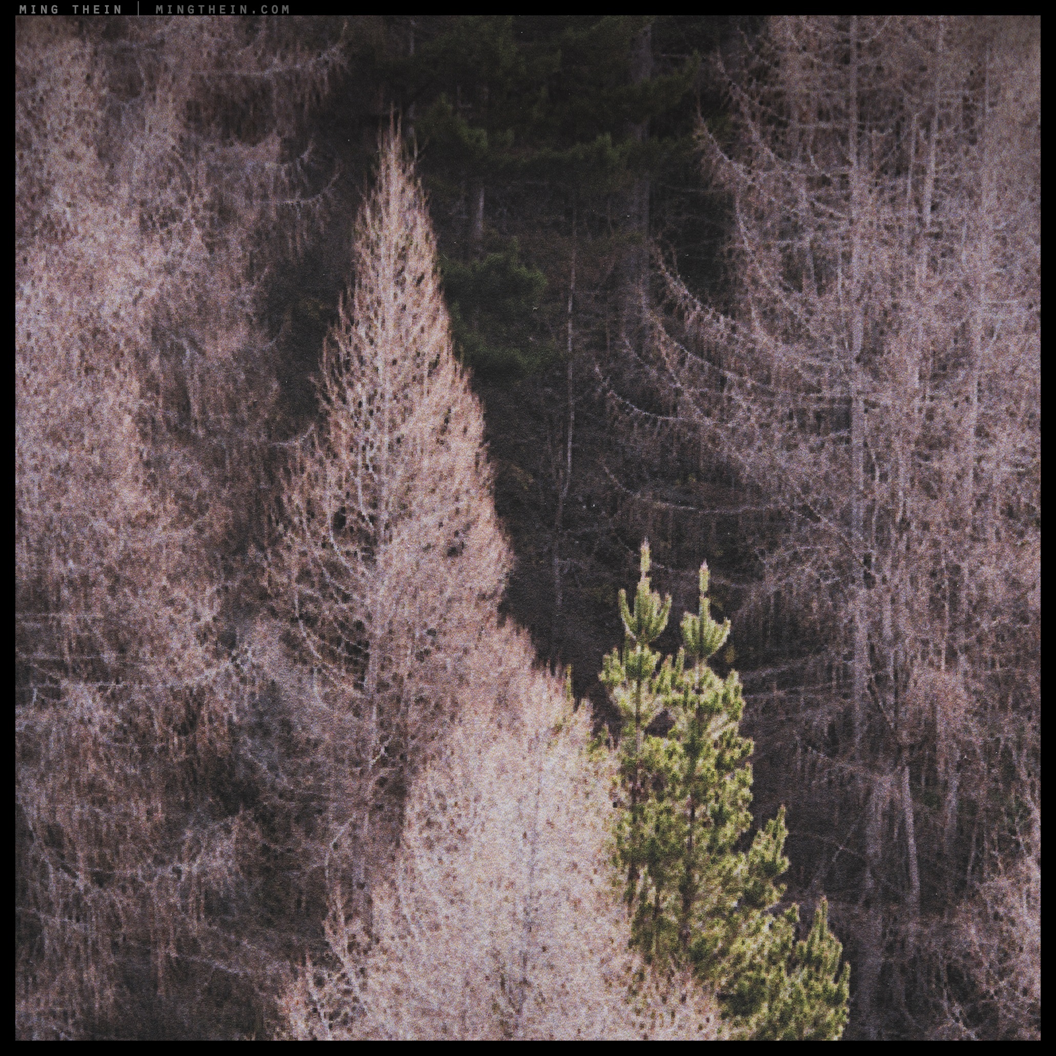
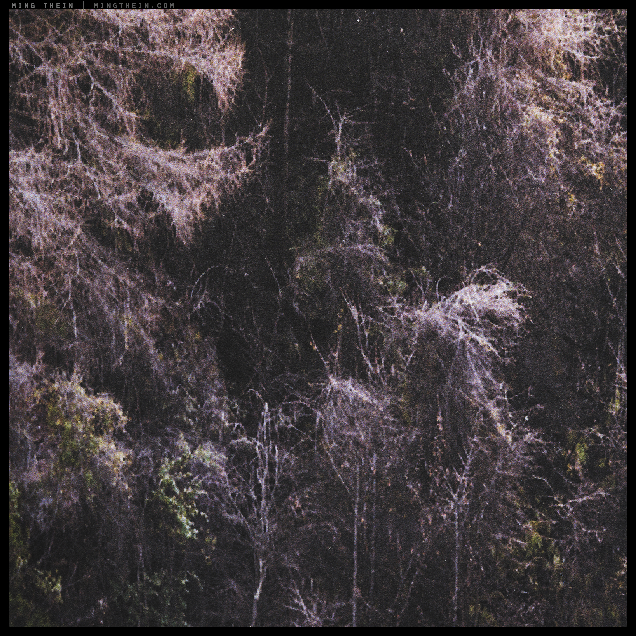
Here are high-magnification versions from several areas of the images, shot with a D810 and Nikon 60mm macro (for both resolution and a relatively human-scale perspective). Viewing the closeup crops as-presented on a 15″ wide monitor would be equivalent to viewing at 6-8 inches from the actual print. The 100% version would obviously be much, much greater. Click on the images to view larger versions.
240PPI, equivalent to a standard print

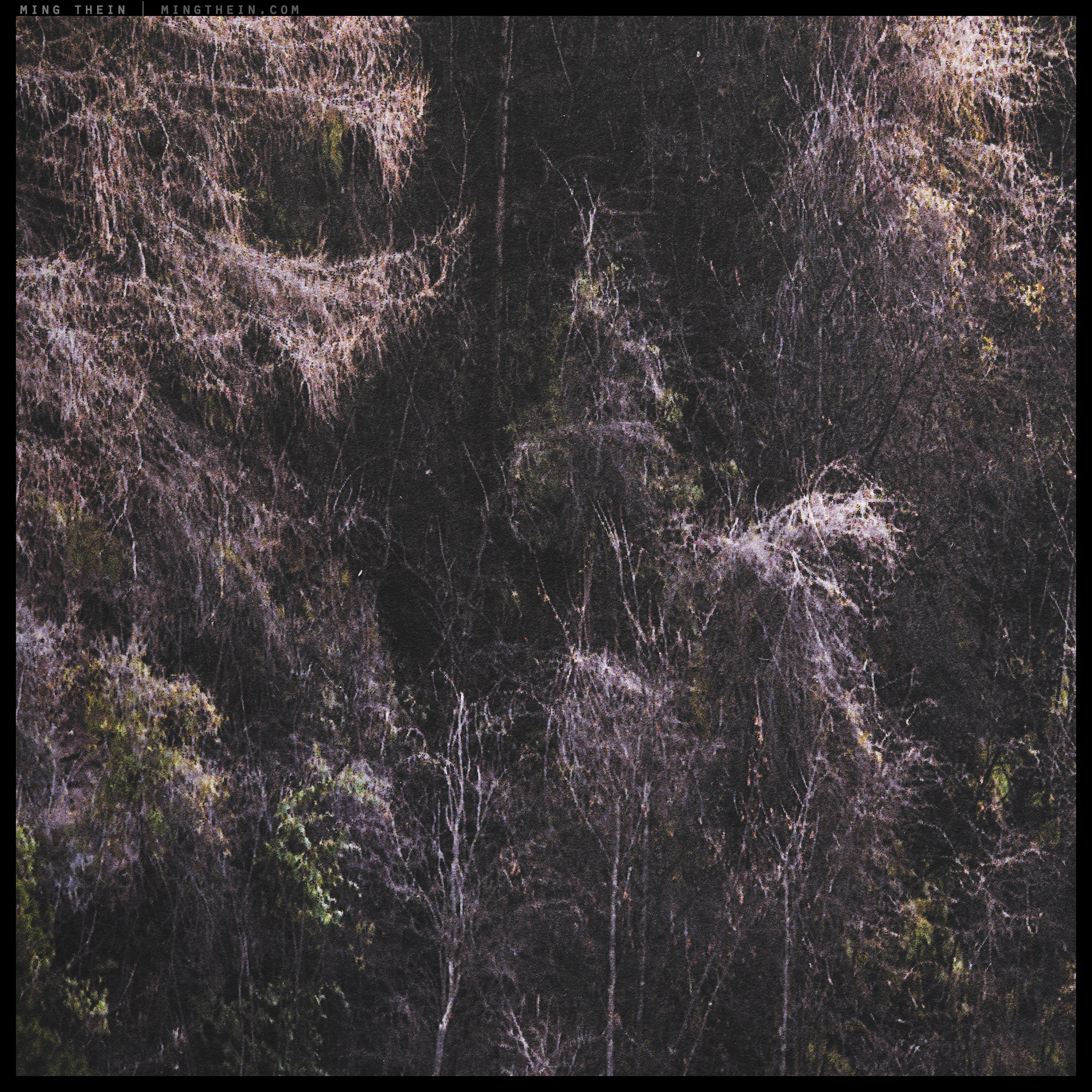
360PPI with latest generation Ultraprint process and hardware, equivalent to first generation 720PPI Ultraprint
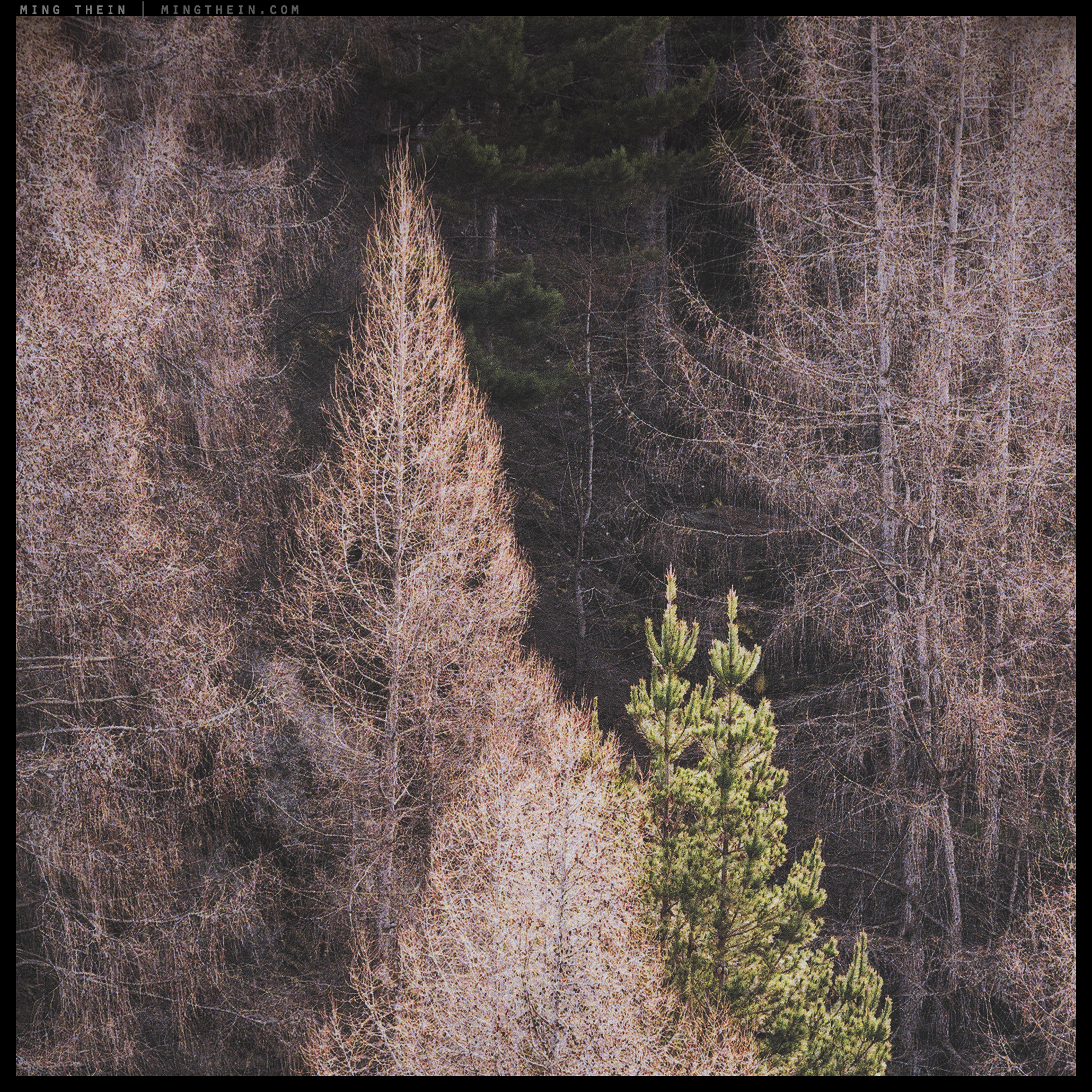

720PPI, latest 3rd-generation Ultraprint
And finally, for scale: that black thing is a human hair, and you’re looking at about 50mm square on the final print. Note how in the larger version you can see detail that is clearly finer than the hair – at times up to 1/3rd the width or thereabouts. Are we in contact printing territory? I think so; it’s pretty much at the limits of what the (already very smooth, and baryta-coated) paper can resolve.

720PPI, latest 3rd-generation Ultraprint. Larger version
I believe there are several conclusions you can come to easily:
- At 2ft viewing distances, all three look pretty good – this would be considered relatively close viewing for a print that’s in itself 3.5ft long, because you already cannot take in the entire image at a single glance.
- At 1ft viewing distance, it’s clear from the 240PPI image that you are looking at a print, and it’s beginning to appear resolution-limited especially in the high frequency/low contrast details read, such as the tops of the trees, and there are limits in resolution – within expected tolerances. The 360PPI and 720PPI images still look good. There’s also a subtle but noticeable difference in color between the three; the higher the resolution, the more subtle and rich colours appear. This is easily explained: the more ink dots you can lay down, the finer the tonal and spectral gradations are possible. Print resolution affects tonality.
- At 6″ viewing distance, which is about the limit for most people’s eyes, the 360PPI image is clearly resolution image. The 720PPI image still appears to have more detail – it is actually at about the practical limit of what a person with perfect eyesight can resolve, and also (for now) the limits of the hardware and media. I’m not even going to talk about the 240PPI image.
I have chosen subject matter that does have an enormous amount of high frequency detail, but even on subjects that do not, the tonal benefits still apply; large areas of color are seldom a single RGB value, but display subtle shifts which we register only subconsciously in real life. However, my Ultraprints do faithfully replicate this.
The net difference is one of immersiveness and transparency. This is obviously not suitable or desirable for all subject matter and artistic intention, but my creative aim is to find ways to deploy this to maximum effect; so far, natural scenes seem to benefit the most. It is worth mentioning that due to improvements in both capture and print workflow, hardware and process, the first generation of Ultraprints (e.g. Autumn in Tokyo) sits somewhere between the 360PPI and 720PPI examples, perceptually; closer to the 360PPI side, I’d say. Everything from New Zealand onwards is at the 720PPI end; the effect in person is rather difficult to describe, but extremely three-dimensional. I am now experimenting with much larger – 2x3ft – prints from stitched images at the first generation Ultraprint level; they look better at close range than the 360PPI swatch above. The impact of these is even greater; size really does matter, and even at 1ft viewing distance, the prints have more information than the eye can resolve. Immersive? Most definitely; it’s like looking through a window. Of course, I’d like to go to 720PPI on everything, but some subject matter makes this impossible: anything that moves, for instance. Even slight breezes affecting leaves or blades of grass will be visible, and a colossal pain to stitch properly.
Tomorrow, I’ll be announcing the largest Ultraprint yet at 20×30″. It is made from a truly enormous file, sufficient to be printed at 720PPI – we profiled and completed the proof a couple of weeks ago, and I am proud to say this is the most impressive viewing experience yet – it is no longer a print or an image, but a slice of reality, shrunk in one dimension and preserved for posterity. It has room to breathe, and still room for details – the kind of image you can get lost in. MT
__________________
Limited edition Ultraprints of these images and others are available from mingthein.gallery
__________________
Visit the Teaching Store to up your photographic game – including workshop and Photoshop Workflow videos and the customized Email School of Photography; or go mobile with the Photography Compendium for iPad. You can also get your gear from B&H and Amazon. Prices are the same as normal, however a small portion of your purchase value is referred back to me. Thanks!
Don’t forget to like us on Facebook and join the reader Flickr group!

Images and content copyright Ming Thein | mingthein.com 2012 onwards. All rights reserved


Thoughts? Leave a comment here and I'll get back to you.